
01
Problem
Same funds, same pages, opposite needs.
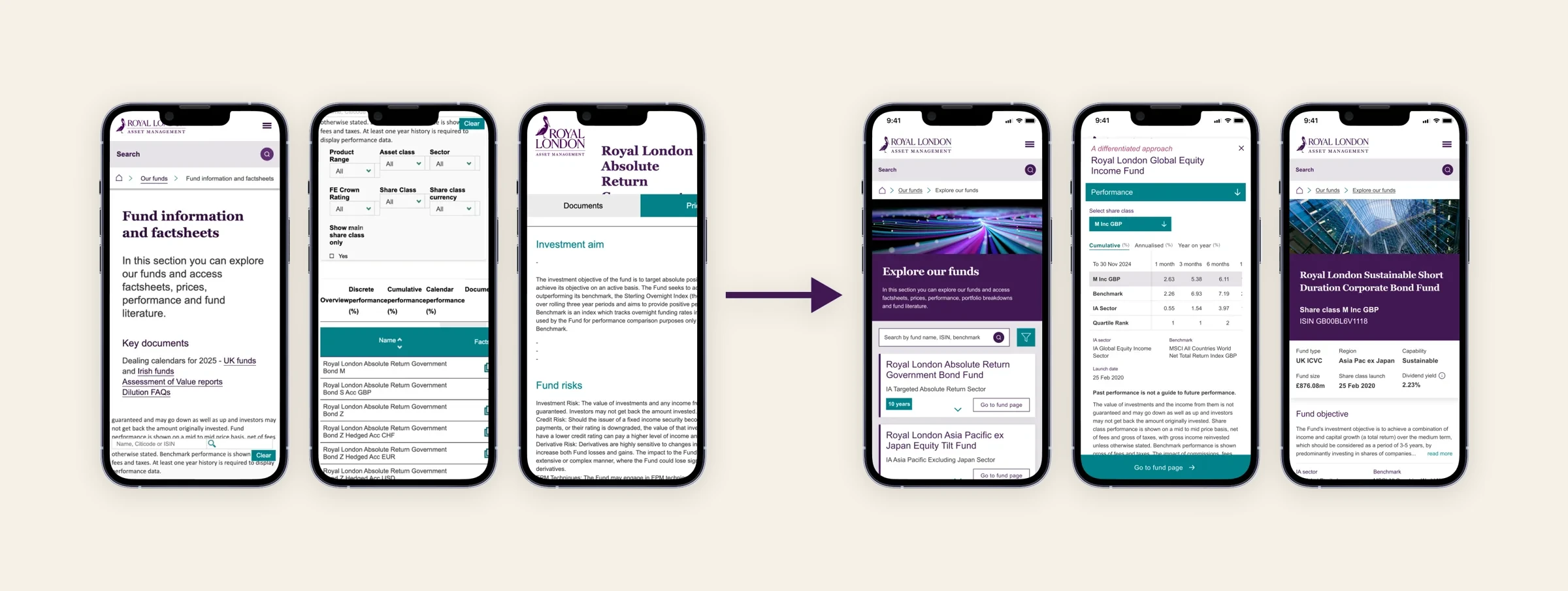
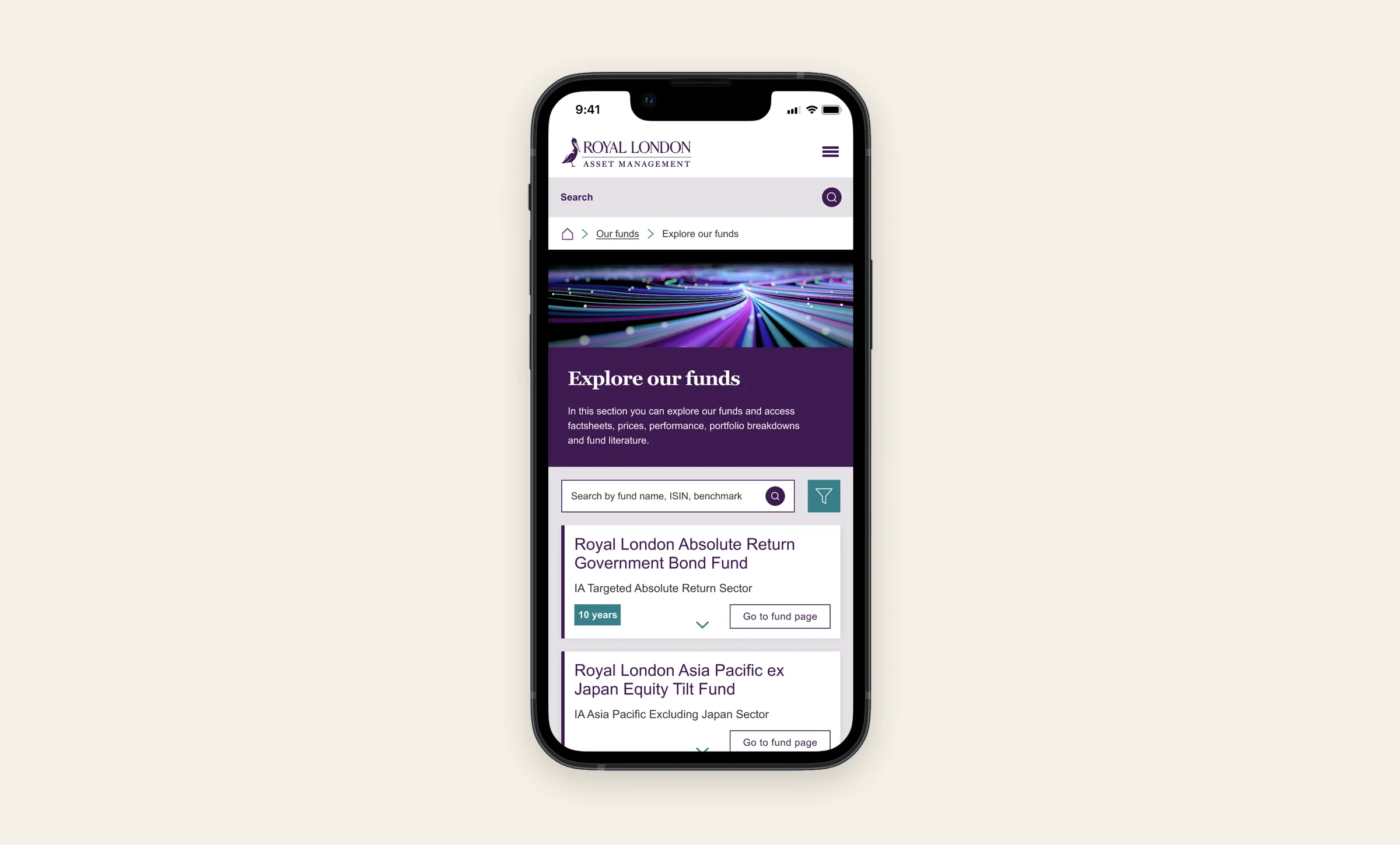
Royal London Asset Management needed one fund platform for financial advisers doing due diligence and individual investors checking where their pension is invested. I designed the design system behind the new fund explorer and fund pages: 40+ reusable components, two audience themes, one codebase.
An adviser wants density: performance attribution, risk metrics, yields. An individual investor sees that same page and quietly closes the tab. When people feel lost with their own money, they stop trusting it.
Regulation pulls both ways too. For a professional, a disclosure is part of the job. For an individual investor, it's one of the first signs they can trust you, so it has to be clear and easy to find.
The obvious answer was two separate sites. I didn't want that. Two codebases means every fund launch, every regulatory change and every rebrand happens twice, and within a year the two sites drift apart like cousins who only meet at weddings.

02
Approach
Listening first. I ran 10 semi-structured interviews with institutional clients and advisers. The same problems kept coming up: finding fund data, knowing what matters first, and knowing what to trust. Those findings decided which components we built first.
Compliance from day one. Instead of sprinkling disclaimers over finished screens and hoping for the best, I brought the regulatory requirements in at the start. Disclosure components have built-in prominence levels for each audience.
Testing the details. I A/B tested two fund overview cards: a compact layout and a richer snapshot with a trend sparkline. The richer one got 12% more "view more" clicks.
Handoff. Close work with engineering on specs and documentation, so components were reused properly and both themes stayed consistent in production.

03
System
One library, two themes. Every one of the 40+ components works in an Intermediary theme and an Individual theme. Engineering switches between them with one variable. Design it once, use it everywhere. That's what made 3 months possible.
Tokens that decide content, not just colour. Three levels: global brand values, theme overrides, component values. Some tokens control what appears and how prominent it is, like --show-technical-data and --disclaimer-prominence. So the Individual theme doesn't just look softer. It puts plain-language descriptions and disclosures first.

04
Outcome
Because we started with reusable components, we delivered it in 3 months.
05
Results
- 3 months, concept to delivery
- 40+ reusable components
- 10 client and adviser interviews
- +12% "view more" clicks on the richer fund card
06
What I'd do differently
I'd document as I go. With 3 months and 40+ components, most of the guidelines got written at handoff, when the decisions were fresh in nobody's mind, including mine. Writing usage notes alongside each component would have made handoff faster and the system easier for the next team to pick up.
More screens
More screens
Senior Product Designer · London
Let'stalk.
Something complex? Good.