

01
Problem
Financial data has to be right before it can be pretty.
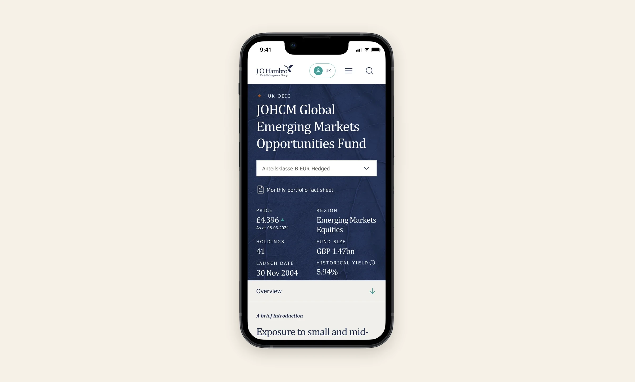
I designed the wireframes, concept, design system and UI for a new fund explorer for J O Hambro Capital Management, a global investment boutique with offices across Europe, Asia and the US.
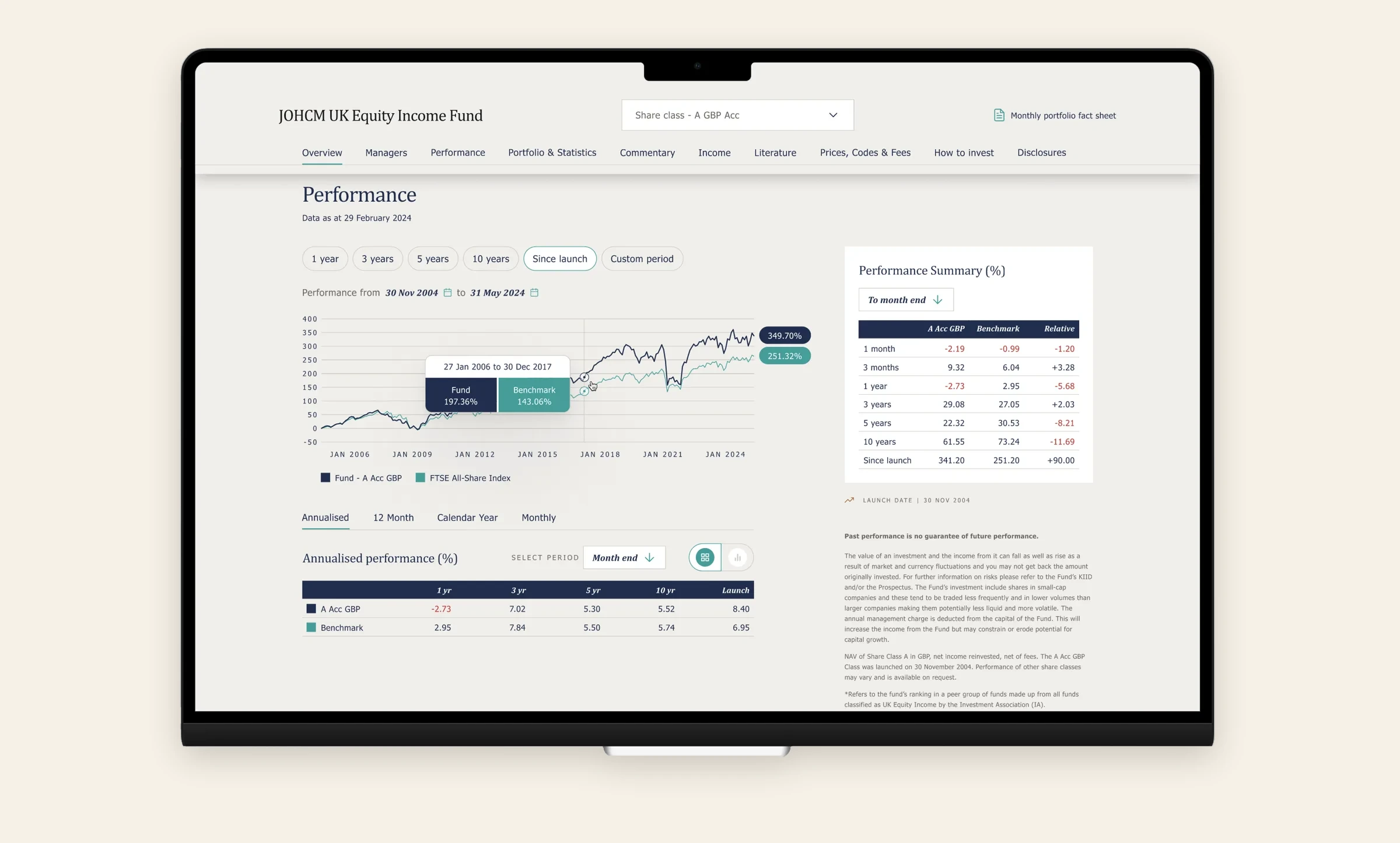
Fund pages carry a lot of weight: performance, charts, documents, disclosures, for institutional and wholesale clients who notice when a number looks off. The explorer also had to work across regions and audiences, and plug into sales and marketing tools.

02
Approach
Tokens and variables first. Colour, type and spacing ran on tokens and variables, so the same components held up across desktop, tablet and mobile.
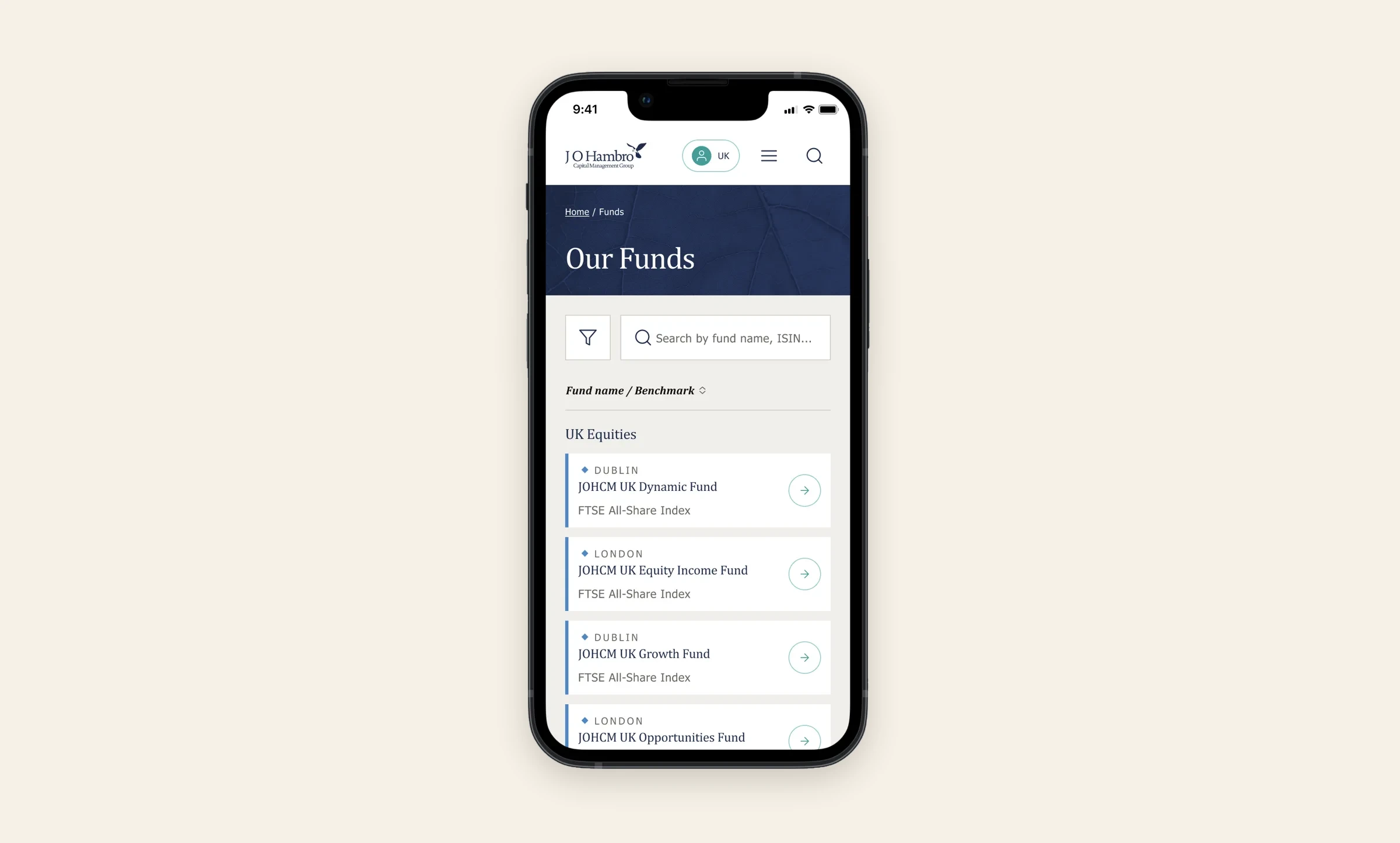
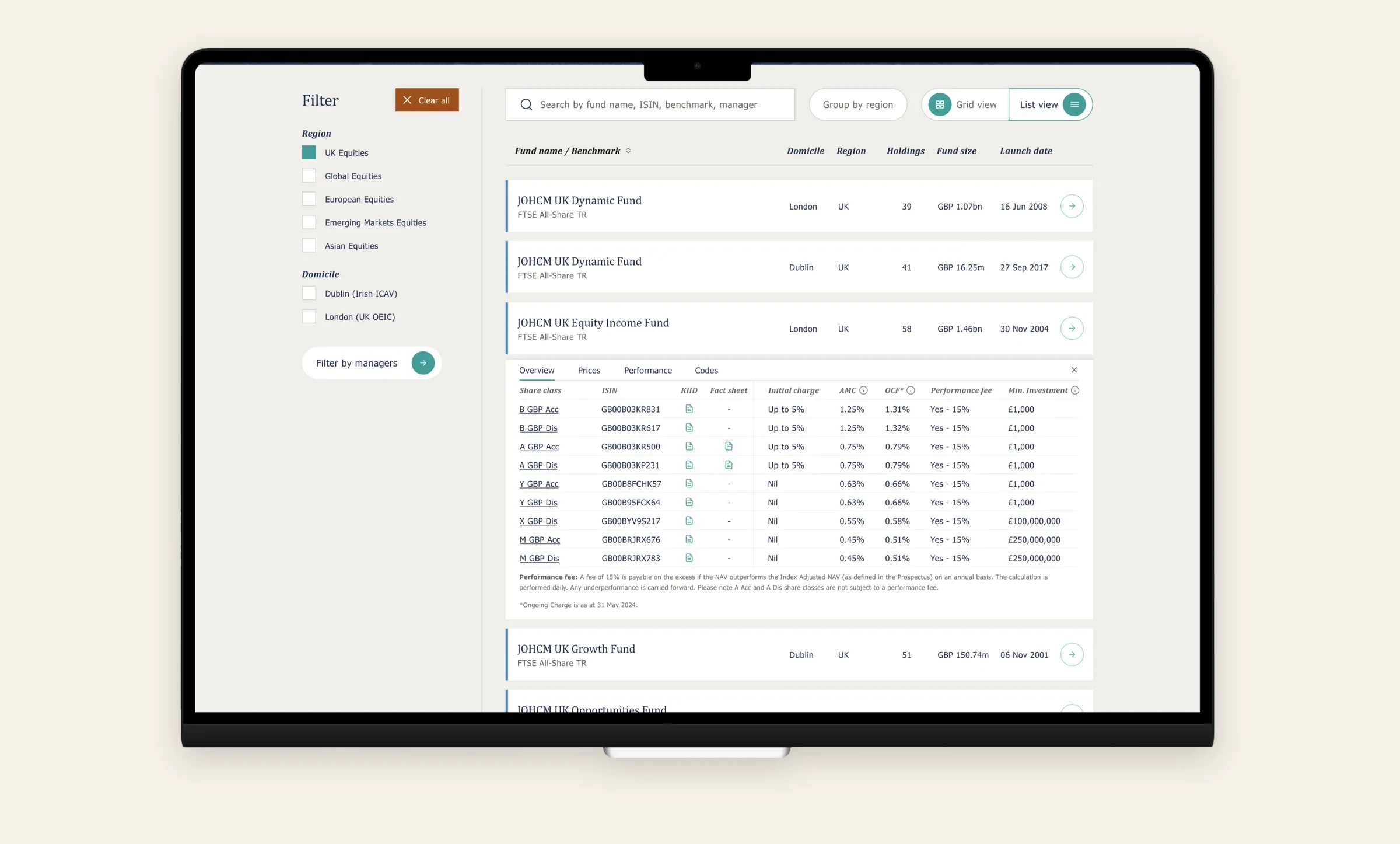
Modular explorer. Filters, fund cards and data modules all came from one component library, so new views could be assembled rather than redesigned.
Progressive disclosure. A "view more" pattern reveals complex fund detail on demand, so the first screen stays readable.

03
System
Theme flexibility. Core components adapt colour, type and structure for different themes without breaking accessibility. One component library behind every explorer view, on every breakpoint.

04
Outcome
The system was built on design tokens, variables and reusable brand components, so future projects could start from the same foundation instead of from scratch.
05
Results
- Built on the shared component system that now serves five UK asset managers. Once it was in place, component implementation got around 40% faster.
06
What I'd do differently
I'd set the token structure before designing a single screen. It's easier to lay the carpet before the furniture arrives.
More screens
More screens
Senior Product Designer · London
Let'stalk.
Something complex? Good.